

|
|
|
You can use the Properties tab to configure properties that determine the functionality and style of the currently selected element.
.gif)
For example, the Validation property can be configured to apply an email validation to a Text input element.
Online form builder - Properties tab key properties and buttons
Properties
You can use this table to determine the functionality of the properties in the Properties tab.
Property |
Description |
|---|---|
|
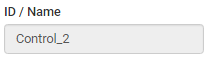
Identification name for the selected element. |
|
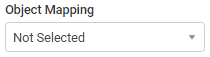
Select a Synergetic object library from the drop-down list to map to the selected element. See Mapping elements to Synergetic fields. Once you have selected an object library you can select a field using the Field/Param Mapping property. See below. Note: You cannot publish a form if there are elements without mapping. Note: Additional objects can be made available for Basic form types. |
|
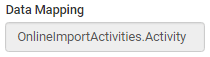
Synergetic data library mapped to the selected element. Note: This property is read-only. |
|
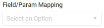
Once you have selected a Synergetic object library using the Object Mapping property you can use this property to select a field within the library. See Mapping elements to Synergetic fields. Note: You cannot publish a form if there are elements without mapping. Note: Additional fields can be made available for Basic form types. |
|
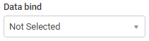
Select a Synergetic lookup table to populate its values into the selected Select input element. Note: Data bindings can come from either a table or a stored procedure. For example, you could populate lookup table values from the luCountry lookup table to allow users to select their home country.
See Populating drop-down lists with Synergetic lookup table values. Note: Additional data bindings can be made available for all form types. |
|
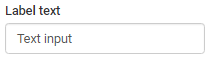
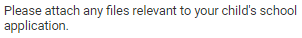
Type into the field to change the text label displayed above the selected element.
|
|
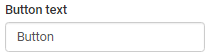
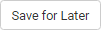
Type into the field to change the text of the selected Button element.
|
|
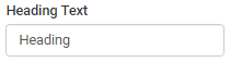
Type into the field to change the heading text of the selected Heading element.
|
|
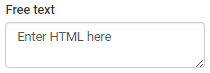
Type into the field to change the text displayed in the selected HTML text element.
|
|
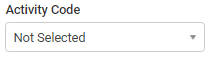
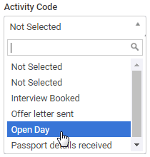
Select an activity from the drop-down list to map the activity to the selected Activity Name element.
See Mapping activity elements to Synergetic activities. Note: You can populate this drop-down list by selecting the FormEditorFlag field in the luActivity lookup table. See luActivity lookup table in the Synergetic System maintenance manual.
Note: You cannot publish until all activity elements have been mapped to activities from the luActivity lookup table. See Resolving publishing errors. |
|
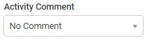
Select whether a comment field is provided for the selected Activity Name element. |
|
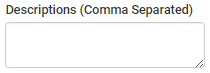
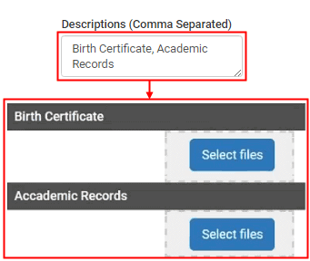
Type comma-separated descriptions into this property to define sections of the selected File uploader element.
|
|
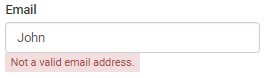
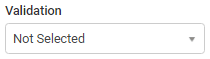
Select a validation rule for the selected element that determines whether correct information is entered. You can select to validate for:
For example, the following field has an email validation that displays a notification if the field does not contain a valid email address.
|
|
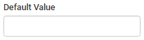
Type into the field to define the default text for the selected Input Control text element. |
|
Select or deselect the flag to define the default state of the selected:
|
|
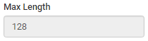
Displays the maximum allowable number of characters for the selected:
Note: This property is read-only. |
|
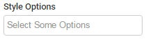
Select a style option from the drop-down list to apply the style to the selected element. Styles are pre-defined depending on the field type. They appear as options in the drop-down list:
|
|
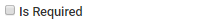
Select this field to prevent form submission if the user has not populated the selected element. |
|
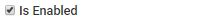
Clear this field to make the selected element read-only. |
|
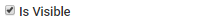
Clear this field to hide the selected element. |
Buttons
Button |
Description |
|---|---|
|
Launch the Event Manager window for the selected element. See Creating events. |
|
Launch the Public Account Control Mapping window for the selected Text input element. See Linking text fields to user account details. |
Last modified: 11/07/2017 3:21:15 PM
|
See Also |
|
|
|
© 2017 Synergetic Management Systems. Published 29 June 2017. |

 Opening the Properties tab
.gif)
.gif)
.gif)
.gif)
property.gif)
.gif)
.gif)